2. 桃園市住宅、機車、汽車竊盜點位
感謝桃園市政府警察局林應龍,提供程式原始碼並授權本篇刊載。
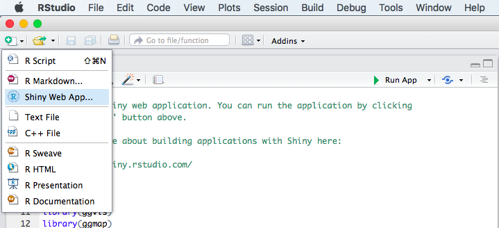
本篇採用R語言與RStudio的Shiny套件進行開發。
本次分析採用shiny、ggvis、ggmap、dplyr、RgoogleMaps、ggplot2、RColorBrewer套件,請使用RStudio,點選新增"Shiny Web App"
登打想要的應用程式名稱,選擇Single File(app.R)

將三個檔案合併為一個csv,檔案更名為Taoyuan_crime.csv,方便接下來的資料分析作業:
library(shiny)
library(ggvis)
library(ggmap)
library(dplyr)
library(RgoogleMaps)
library(ggplot2)
library(RColorBrewer)
data <- read.csv("Taoyuan_crime.csv",fileEncoding = "utf8")

# Define UI for application that draws a histogram
ui <- shinyUI(fluidPage(
  titlePanel("桃園竊盜分析"),
  h3("Datarange:104/11~105/1", style = "color:red"),
  downloadButton('downloadData', 'Download'),
  br(),
  span("last update:105/2/5", style = "color:blue"),
  mainPanel(
    tabsetPanel(type = "tabs",
                tabPanel("竊盜熱點",
                         fluidRow(
                           column(3,
                                  selectInput("map_type", label = h4("竊盜種類"),c("All","機車竊盜","住宅竊盜","汽車竊盜")),
                                  selectInput("map_breau", label = h4("分局"),
                                              c("All","桃園分局","中壢分局","楊梅分局","大園分局","大溪分局","平鎮分局","八德分局","龜山分局","蘆竹分局","龍潭分局")),
                                  selectInput("map_year", label = h4("年月"),c(10411,10412,10501)),
                                  sliderInput("map_zoom", label = h4("縮放"),min = 11, max = 14, value = 11),
                                  span("Design by TYPD", style = "color:darkorange")
                           ),
                           column(6,
                                  h3("竊盜密度圖"),
                                  plotOutput("map",width = "800px",height = "800px")
                           )
                         )),#map_panel
                tabPanel("轄區分析",
                         fluidRow(
                           column(3,
                                  selectInput("anb_year", label = h4("年度"),c(10411,10412,10501)),
                                  span("Design by TYPD", style = "color:darkorange")

                           ),
                           column(3,
                                  h3("轄區竊盜件數堆疊直方圖"),
                                  ggvisOutput("breau_plot")
                           )
                         )
                ),#Analysis_breau_panel
                tabPanel("資料檢視",
                         fluidRow(
                           column(3,
                                  selectInput("data_type", label = h4("竊盜種類"),c("All","機車竊盜","住宅竊盜","汽車竊盜")),
                                  selectInput("data_breau", label = h4("分局"),
                                              c("All","桃園分局","中壢分局","楊梅分局","大園分局","大溪分局","平鎮分局","八德分局","龜山分局","蘆竹分局","龍潭分局")),
                                  selectInput("data_year", label = h4("年度"),c(10411,10412,10501)),
                                  span("Design by TYPD", style = "color:darkorange")
                           ),
                           column(6,
                                  h3("資料檢視"),
                                  tableOutput("Data")
                           )
                         )
                )#Data_panel
    )
  )#mainPanel
))
# Define server logic required to draw a histogram
server <- shinyServer(function(input, output) {

  output$downloadData <- downloadHandler(
    filename = function() { paste('Taoyuan_crime', '.csv') },
    content = function(file) {
      write.csv(data, file,row.names = F,fileEncoding = "utf8")
    })#下載資料功能

  zoom <- reactive({
    input$map_zoom
  })#地圖縮放


  output$map <- renderPlot({
    ym <- as.numeric(input$map_year) #轉換為numeric
    y1 <- round(ym / 100) #取前3個數字
    m1 <- ym %% 100 #取後2個數字
    if(input$map_breau == "All" & input$map_type == "All"){
      fdata <- data %>%
        filter(year == y1,month == m1)
    }else if(input$map_breau == "All" & input$map_type != "All"){
      fdata <- data %>%
        filter(year == y1,month == m1,type == input$map_type)
    }else if (input$map_breau != "All" & input$map_type == "All"){
      fdata <- data %>%
        filter(year == y1,month == m1,breau == input$map_breau)
    }else{
      fdata <- data %>%
        filter(year == y1,month == m1,breau == input$map_breau,type == input$map_type)
    }#過濾地圖資料

    getmap <- get_googlemap(center = c(lon = mean(fdata$lon),lat = mean(fdata$lat)),zoom=zoom(),maptype = "roadmap")
    #根據點位中心取得地圖
    ggmap(getmap,extent = "device",ylab = "lat",xlab = "lon",maprange=FALSE) +
      geom_point(data = fdata,colour = "darkred", pch=16, cex= 2.5,alpha = 1) +
      stat_density2d(data = fdata, aes(x = lon, y = lat,  fill = ..level.., alpha = ..level..),size = 0.01, geom = 'polygon')+
      scale_fill_gradient(low = "green", high = "red") +
      scale_alpha(range = c(0.05, 0.15))  +
      theme(legend.position = "none")
  })#根據取得的地圖畫出地圖內的點跟密度

  breau_plot <- reactive({
    ym <- as.numeric(input$anb_year)
    y1 <- round(ym / 100)
    m1 <- ym %% 100
    data %>%
      filter(year == y1,month == m1) %>%
      group_by(breau,type) %>%
      summarise(count = n()) %>%
      ggvis(~breau,~count) %>%
      layer_bars(fill = ~type,width = 0.5)
  })#堆疊直方圖
  breau_plot %>% bind_shiny("breau_plot")

  output$Data <- renderTable({
    ym <- as.numeric(input$data_year)
    y1 <- round(ym / 100)
    m1 <- ym %% 100
    if(input$data_breau != "All" & input$data_type != "All"){
      data %>% filter(year == y1,month == m1,breau == input$data_breau,type == input$data_type)
    }else if(input$data_breau !="All" & input$data_type == "All"){
      data %>% filter(year == y1,month == m1,breau == input$data_breau)
    }else if(input$data_breau =="All" & input$data_type != "All"){
      data %>% filter(year == y1,month == m1,type == input$data_type)
    }else{
      data %>% filter(year == y1,month == m1)
    }
  })#資料檢視過濾
})
# Run the application
shinyApp(ui = ui, server = server)
點選RunApp,從瀏覽器進行互動性的資料分析。